When visualizing data, we often need to show different types of data on the same graph. For example, we might want to display monthly revenue (₩) on one axis and the number of visitors on the other. In such cases, ggplot2’s dual Y-axis (sec.axis) feature helps us compare the data more effectively.
In this post, we’ll learn how to use ggplot2 to combine a bar chart and a line graph in one plot, making it easier to compare data with different units.
📋 Preparing the Data
I downloaded data for the SCHD ETF from Yahoo Finance and filtered it to cover the period from January 1, 2012, to January 31, 2025. Then, I assumed a daily investment of 1,000 KRW over five years and planned to visualize the returns as a graph. I’ll skip the data processing steps and focus on the final dataset, which has the following layout:
rate: Return ratecum_amt1: Cumulative investment amountclose: Closing price
print(table_schd31)

# A tibble: 3,290 × 4
   date       close      rate cum_amt1
   <date>     <dbl>     <dbl>    <dbl>
 1 2012-01-03  8.81 -1.42e-14     1000
 2 2012-01-04  8.81 -1.42e-14     2000
 3 2012-01-05  8.8  -7.57e- 2     3000
 4 2012-01-06  8.76 -3.97e- 1     4000
 5 2012-01-09  8.78 -1.36e- 1     5000
 6 2012-01-10  8.84  4.55e- 1     6000
 7 2012-01-11  8.81  9.81e- 2     7000
 8 2012-01-12  8.81  8.58e- 2     8000
 9 2012-01-13  8.77 -3.28e- 1     9000
10 2012-01-17  8.82  2.17e- 1    10000
# ℹ 3,280 more rows
# ℹ Use `print(n = ...)` to see more rows
📈 Creating the Graph
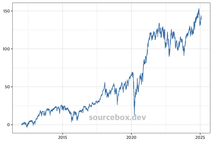
Let’s build the graph step by step using ggplot2. First, we’ll create a line graph using the final return rate (rate).
ggplot(table_schd31) +
  geom_line(aes(date, rate), colour ="steelblue")
  theme_bw()
Next, we’ll add another line graph for the cumulative investment amount (cum_amt1).
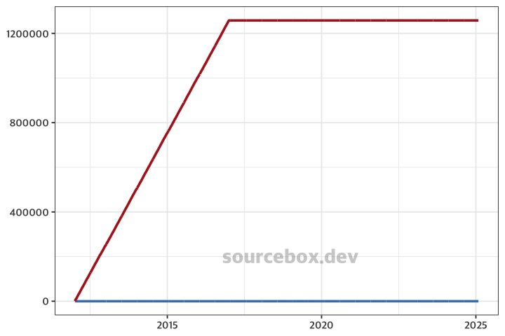
⛔ Problem: The two line graphs have very different ranges. As a result, the return rate graph (rate) appears almost like a flat line.
ggplot(table_schd31) +
  geom_line(aes(date, rate), colour ="steelblue") +
  geom_line(aes(date, cum_amt1), colour = "firebrick", size = 1) +
  theme_bw()
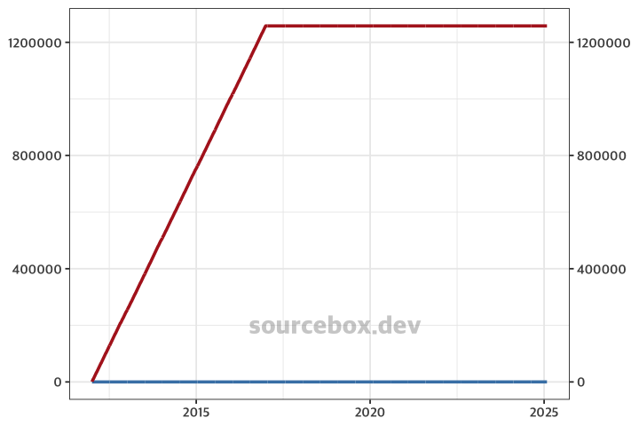
🚀 In this case, we need to set separate Y-axes for each dataset.
To do this, we use the sec.axis parameter in the scale_y_continuous function. However, if we simply add a secondary axis without scaling the values, the only visible change will be the addition of a right-side Y-axis—without solving the original issue.
ggplot(table_schd31) +
  geom_line(aes(date, rate), colour ="steelblue") +
  geom_line(aes(date, cum_amt1), colour = "firebrick", size = 1) +
  scale_y_continuous(sec.axis = ~ .) +
  theme_bw()
To fix this, we need to adjust the two Y-axis ranges to be more similar by applying a transformation like: aes(date, cum_amt1 / 30000). However, this causes a new problem—the values on the right Y-axis become distorted.
ggplot(table_schd31) +
  geom_line(aes(date, rate), colour ="steelblue") +
  geom_line(aes(date, cum_amt1 / 30000), colour = "firebrick", size = 1) +
  scale_y_continuous(sec.axis = ~ .) +
  theme_bw() +
  theme(axis.title = element_blank())
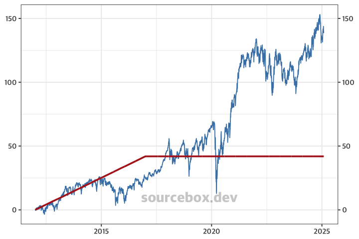
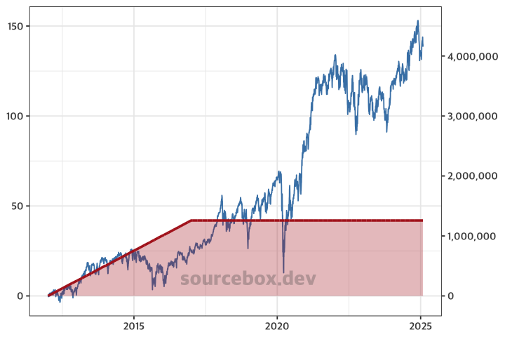
To correct the distortion, we can handle it in scale_y_continuous. By multiplying the values by 30,000 again, the right Y-axis will display the original data values correctly.
ggplot(table_schd31) +
  geom_line(aes(date, rate), colour ="steelblue") +
  geom_line(aes(date, cum_amt1 / 30000), colour = "firebrick", size = 1) +
  scale_y_continuous(sec.axis = ~ . * 30000) +
  theme_bw() +
  theme(axis.title = element_blank())
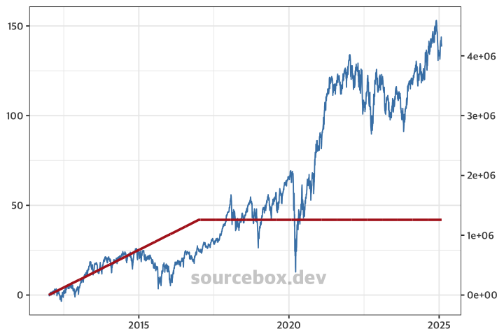
Finally, to display the Y-axis values as regular integers instead of scientific notation, we can set the labels parameter. To modify the settings for the second Y-axis, you need to use the sec_axis function.
Additionally, I switched to geom_area to fill the area under the line graph with color, completing the chart.
ggplot(table_schd31) +
  geom_line(aes(date, rate), colour ="steelblue") +
  geom_area(aes(date, cum_amt1 / 30000), colour = "firebrick",
            size = 1, fill = "firebrick", alpha = 0.3) +
  scale_y_continuous(sec.axis = sec_axis(~ . * 30000, labels = scales::label_number())) +
  theme_bw()