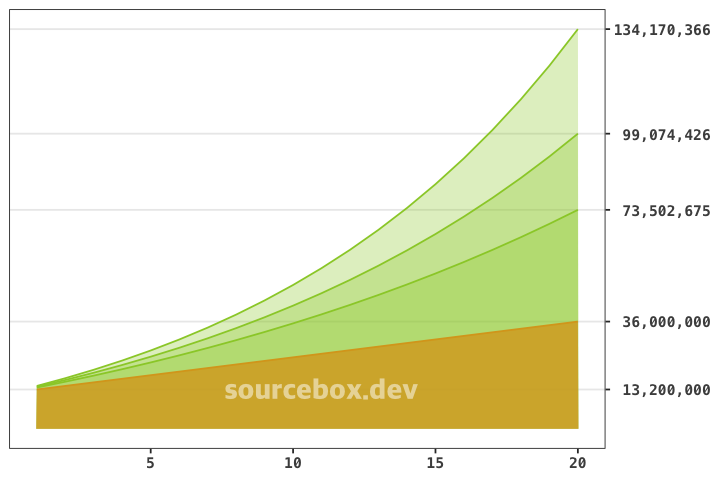
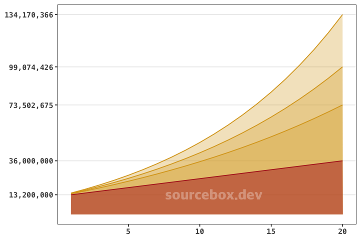
By default, ggplot2 places the y-axis on the left side of the plot. However, there are cases where shifting the y-axis to the right improves readability and enhances data visualization. For example, in the graph below, positioning the y-axis on the right makes the data easier to interpret. In this post, we’ll go over how to move the y-axis to the right in ggplot2.
Data Overview
The dataset represents the projected total value of an investment over 50 years, assuming an initial principal of 12 million KRW and annual contributions of 1.2 million KRW. Three scenarios are considered, each with different annual returns: 5%, 7%, and 9%.
cum_deposit: Cumulative deposits without any returns applied.eval_value1: Final value assuming a 5% annual return.eval_value2: Final value assuming a 7% annual return.eval_value3: Final value assuming a 9% annual return.
> print(tb4)
# A tibble: 50 × 5
       t cum_deposit eval_value1 eval_value2 eval_value3
   <dbl>       <dbl>       <dbl>       <dbl>       <dbl>
 1     1    13200000   13860000    14124000    14388000
 2     2    14400000   15813000    16396680    16990920
 3     3    15600000   17863650    18828448.   19828103.
 4     4    16800000   20016832.   21430439.   22920632.
 5     5    18000000   22277674.   24214570.   26291489.
 6     6    19200000   24651558.   27193590.   29965723.
 7     7    20400000   27144136.   30381141.   33970638.
 8     8    21600000   29761343.   33791821.   38335995.
 9     9    22800000   32509410.   37441248.   43094235.
10    10    24000000   35394880.   41346135.   48280716.
# ℹ 40 more rows
# ℹ Use `print(n = ...)` to see more rows
Plotting the Graph
This type of dataset is well-suited for visualization using geom_area(). Stacking the areas makes it easy to compare the differences in returns. By default, the y-axis appears on the left.
ggplot(tb4 |> filter(t <= 20)) +
  geom_area(aes(t, eval_value3), alpha = 0.3,
            colour = "goldenrod", fill = "goldenrod") +
  geom_area(aes(t, eval_value2), alpha = 0.3,
            colour = "goldenrod", fill = "goldenrod") +
  geom_area(aes(t, eval_value1), alpha = 0.3,
            colour = "goldenrod", fill = "goldenrod") +
  geom_area(aes(t, cum_deposit), alpha = 0.5,
            colour = "firebrick", fill = "firebrick") +
  scale_y_continuous(labels = label_comma(),
                     breaks = c(13200000, v_breaks)) +
  theme_bw(base_family = "Menlo") +
  theme(axis.title = element_blank(),
        axis.text = element_text(face = "bold"),
        panel.grid.minor = element_blank(),
        panel.grid.major.x = element_blank())
For better readability, shifting the y-axis to the right can be helpful. This can be done easily by adding position = "right" in scale_y_continuous().
scale_y_continuous(labels = label_comma(),
                   breaks = c(13200000, v_breaks),
                   position = "right")
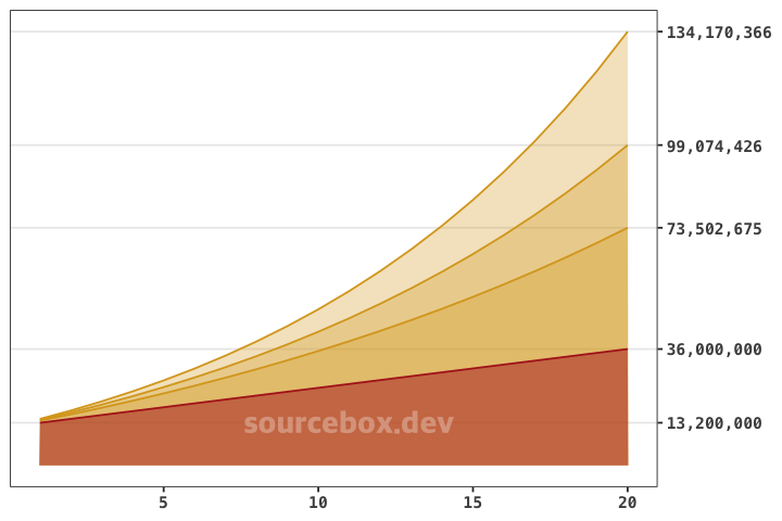
To make the graph look cleaner, you can align the y-axis labels to the right for better readability. You can do this by adjusting the theme() settings like this:
theme(axis.title = element_blank(),
      axis.text = element_text(face = "bold"),
      panel.grid.minor = element_blank(),
      panel.grid.major.x = element_blank(),
      axis.text.y.right = element_text(hjust = 1))
